Ignition 8.1.0: Long-Term Support, Perspective Workstation, Perspective Symbols, Power Chart & Much More

Ignition 8.1 is here! With it comes two trains' worth of cargo. This post will be a bit longer than normal since we have a lot of ground to cover. Let’s take a look at what's new.
Ignition 8 – Now with LTS
With Ignition 8.1 comes a version of Ignition 8 that falls under Long-Term Support (LTS). This is something many of you have been waiting for, and is reason enough to celebrate: All of the features and new functionality added to the 8.0 branch, served up on a platter with a healthy five-year promise of patches and support.
Perspective
Let’s focus on the Perspective Module for a moment, as it has some new toys for everyone to play with. Starting with the big one …
Perspective Workstation
Think of the Ignition Perspective Mobile App. Sure, you could simply use a device’s built-in web browser to view a session from a mobile device, but the app gives you a bunch of additional benefits. It has a built-in, searchable project listing that provides easy access to projects from any number of Gateways, all within a single application. Furthermore, it acts as a bridge between the device and the session, allowing your application to use the built-in features available on the device.
Wouldn’t it be neat if there was a similar piece of software for a desktop environment? That’s where Workstation comes in.
Perspective Workstation allows you to deploy and launch a dedicated application that can contain configurations for all of your Perspective sessions. I made a comparison to the mobile app earlier, but you can also equate Perspective Workstation to the Vision Client Launcher and Designer Launcher, in that it’s something you use to launch a running instance of a runtime.
Since Perspective Workstation offers a standalone application, you can run a session without all the shenanigans of a web browser on your desktop, HMI, or workstation interface. Some of the original concerns about using Perspective in a controls environment are those normal trappings of a consumer web browser, such as the address bar, which savvy users might be able to use to access things on the network you might not want them to.
Thus Workstation intentionally hides the address bar and other navigational tools seen on all web browsers, meaning the only method of navigation within a session are the mechanisms you provide through the application.
Next up would be multi-monitor support. An application launched from Workstation can instantiate multiple application windows, all on different monitors. If you want to run a Perspective Session in a multi-monitor environment, such as a control room, Workstation makes it easy to do so without having to shuffle browser tabs to each screen. Simply tell Workstation which Page goes where.
On top of it all, we’re also adding Workstation-specific features. For example, we added several new system functions that allow you to switch to kiosk mode or windowed mode from within a running session, as well as component actions that do the same. We also have a whole bunch of additional functionality I can’t really talk about yet, but look forward to those in future posts.
Perspective Symbol Components
Not to be confused with Symbol Factory, these new components are more than just flat graphics, as each has numerous properties that modify and dictate their behavior.
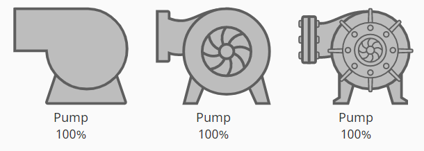
For the unaware, these new components signify a new line of Perspective objects that represent real-world equipment. Each component has built-in labels to represent process values, several different styles, and contextual properties that represent concepts unique to the equipment such as a running state.
Not only that, some of the symbols have built-in animations that can be triggered via state, so you can configure bindings and have a datapoint determine when an animation begins or ends (or, if you’ve living the High-Performance HMI life, just ignore the animations altogether).
The components are naturally simplistic in nature, so there isn’t too much else to say on them. However, we did try to design them in such a way that it’s easy for us to add more later on. If you’d like to offer some suggestions, head over to our Ideas site and leave a post.
Power Chart
Perspective has a new, exciting charting option. The Power Chart is jam-packed with utility and supporting interfaces that make it a powerful addition to the component library.
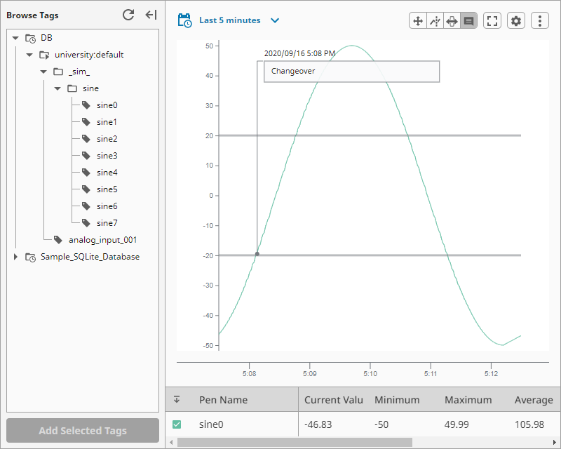
The component takes the feature set of the Time Series Chart component, and adds various panels and options that allow for runtime configurations, allowing your users to create any sort of chart-based report they want by adding new pens (with the built-in tag browser), new plots, annotations, and much more.
You wouldn’t be wrong for thinking the Power Chart is Perspective’s version of Vision’s Easy Chart component. In truth, the Easy Chart was a direct inspiration for what we wanted the Power Chart to become. The Easy Chart was beloved for two reasons, the first being general ease of use: no need to write a SQL query, just drag-and-drop tags onto the component to get started. The other reason is the always-helpful runtime configuration, allowing users to make changes to pens on the chart (including adding pens via the Tag Browser component) directly from a Vision Client. In the early days of the Power Chart’s conception, we knew we wanted to have the Power Chart follow in the Easy Chart’s footsteps.
It’s kinda funny that the component is called the Power Chart, since the “chart” aspect of it is really just about 20-25% of the overall component. In short, it has a lot of interactions and features.
I’d talk more about it, but to be honest the component needs to be seen. Check out our IU lessons if you want to learn more about the component.
Identity Providers Everywhere!
Next up we have the further propagation of Identity Provider (IdP) support in Ignition. Since IdPs were added to Ignition back in Version 8.0.0, Perspective has been the only part of the software that’s really been able to use them. This is no longer the case in 8.1.0.
Now, the Designer, Gateway, and Vision can take advantage of IdP authentication, and by association, Security Levels. IdPs and Security Levels haven’t really changed as a result, so their configuration and application is mostly the same. Furthermore, by incorporating IdP support into these other scopes, they now have support for two-factor authentication, which is something our users have been interested in for a long time.
However, the Designer, Gateway, and Vision all were designed around User Sources, so we needed them to evolve a bit before they could use IdPs. Additionally, we don’t want to take the older authentication approach away, as many folks have been happily using User Sources to handle most of their authentication needs for years, and we don’t really see a need to change that.
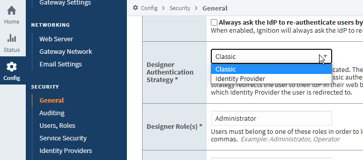
To help with this, and aid our users who don’t want their Vision projects to switch over to Identity Providers yet, we’ve introduced the concept of an “Authentication Strategy,” which you’ll see in a couple of areas, such as a new setting under Vision Project Properties:
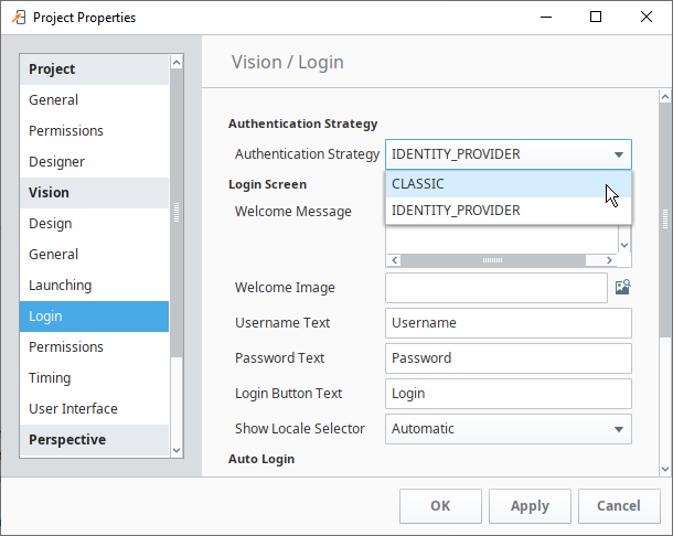
I’m handwaving this a bit, but setting one of these Authentication Strategy dropdowns to “Classic” means “use a User Source for authentication,” so logging into a Vision Client will work the same way it always has.
Switching to an Identity Provider strategy will, on the other hand, swap out the username and password field for a new screen, that will open a web browser leading to your Identity Provider’s login screen.
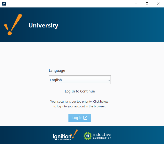
Once authenticated via the browser, users will be given access to the project (assuming they’re authorized for it, of course).
Upgrading from an existing system? No worries, the Classic strategy is used by default to help maintain backwards compatibility. Furthermore, we use it by default on new installations for Vision, so if you’re used to developing Vision projects, you really won’t notice much of a change until you opt into the Identity Provider strategy.
The Designer gets similar treatment, although the setting is on a new Gateway page. Setting this new Designer Authentication Strategy setting to “Identity Provider” will cause Designer sessions to authenticate against an Identity Provider. Or, like Vision, you can leave it set to Classic and stick with just the User Sources.
Since we’re on the topic, we added a new “General” page under the Security heading of the Gateway’s Config section, and migrated all of those security-related settings that were hiding under the Gateway Settings page.
The Gateway, on the other hand, does not have an option for a Classic Authentication Strategy. Starting here, attempts to log into the Gateway will require authentication through an Identity Provider. Fortunately this is an easy migration, as you can still use your existing users and roles by taking advantage of an Ignition Identity Provider, since they’re always backed by a User Source anyways. This also doesn’t mess with the normal authentication flow, as your users attempting to access the Gateway will still do everything via a web browser.
How Do Roles Work in This Brave New World?
Longtime users may be reading about the IdP changes in Vision and be wondering how role restrictions work with IdPs. It’s actually pretty straightforward. Security Levels already have some built-in integration for a concept of “roles,” so when the Authentication Strategy on a Vision project is set to “Identity Provider,” the IdP is already looking for roles that are tied to the user, as determined by the “User Attribute Mapping” settings on the IdP.
Because role checks in Vision and the Designer were always just string comparisons anyways, it’s pretty easy for us to take the security restrictions you’ve applied to components, and compare them to the role security levels.
Quality-of-Life Improvements
Next, we’ve made a number of platform-level improvements that help in a number of different areas. We’ll take a quick look.
Tag Browser UI Improvements
The Tag Browser has a shiny new look with a lot of smaller changes that add up to a quite a bit.
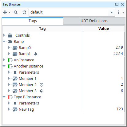
First, we have some new icons for the various tag types, to further help things like Memory Tags stand out from OPC tags.
Next, we got rid of the Trait column. Turns out, with heavily nested folders and UDTs, horizontal space is at a premium as the path to the tag can eat up a lot of space, so we decided to remove the Trait column altogether, and instead move the icons to the end of the name of the tag. You may notice that the Data Type column is missing from the image above, but in actuality it’s just hidden. You can enable it if you’d like.
Next we changed how Tag Providers are represented. You’ll notice a dropdown selector towards the top of the panel that represents which Tag Provider is selected or “active” in the Tag Browser. The old design tripped up a lot of users as it simply placed all tags from all providers in the Tag Browser at the same time, implying that they’re somehow adjacent to each other, which was never really true. This new pattern should hopefully make the concept of Tag Providers easier to understand. If you’re looking for Vision Client Tags, no worries: Just switch over to the Vision workspace in the Designer (you’re probably there already) and select the Vision Client Tags provider.
Another stumbling block for new users was the difference between a UDT Definition and an Instance. Again, largely due to them being visually adjacent to each other (just a folder away in many cases). To help with this, the browser now has some tabs towards the top that allow you to switch between Standard Tags and UDT Instances (“Tags”), and UDT Definitions. Definitions can only be accessed in the latter, while standard tags (memory, OPC, etc) and UDT Instances are accessible from the former.
Lastly, no, you’re not going crazy. We added some color back into the Tag Browser. More specifically, you get to add some color to your UDTs. We found that in systems with a large amount of UDT Instances (e.g., almost all systems) it was difficult to visually scan for certain instances. So we added a new property to UDT Definitions that allows you to assign a color to a definition and all its instances. This doesn’t have any functional impact, but does provide some visual identification that makes it easier to quickly find certain types of UDTs amongst a sea of them.
Tag Creator
Another exciting change is a new way to bring in data points from your various connected devices into a Tag Provider. The Tag Creator is a replacement for the OPC Browser, with some extra functionality. We found that new users would frequently get stuck between creating device connections and getting values from those devices onto a screen — the whole “drag from OPC Browser into Tag Browser” concept is simple once you see it, but new users on their own would miss this step.
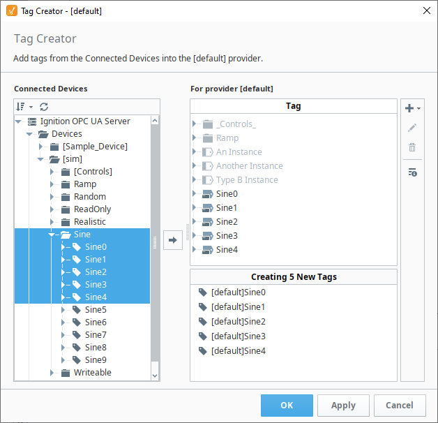
The OPC Browser was a clean panel that served its purpose, but we wanted to add a more catered experience. With the Tag Creator, the OPC Browser still lives on as that tree on the left side of the window, and a tree on the right represents the currently selected Tag Provider. In addition to creating tags, you can also edit tags directly from this window, giving you a sort of a “staging area” to make a number of configuration changes to the tag before it’s actually created.
Furthermore, you can actually create non-OPC tags from the creator. From the icons on the right of the window, you can create a new instance of a standard tag (defaults to a Memory Tag), and then from the same interface change the tag’s type to something else.
Designer Workspaces Landing Tab
Vision did a lot of things right. One of those was having a “home” or landing tab for the workspace in the Designer, letting users look at recently modified resources and create new ones. In 8.1.0 we gave Vision’s landing tab an update. It has the same functionality as before, but fits better with some of the more modern UI features we’ve been introducing to the Designer. Also we added some new quick links to our documentation and an appropriate Gateway status page, both of which are located towards the top of the new UI.
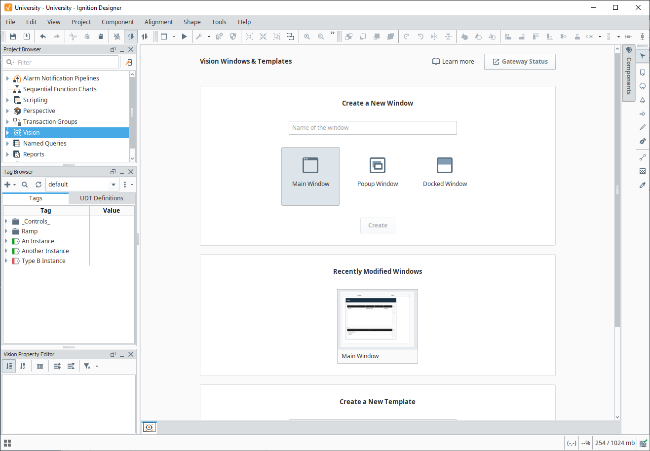
But we didn’t stop there. Lots of other workspaces in the Designer didn’t have an equivalent tab, so we added some. Below you’ll see the new Named Queries landing tab.
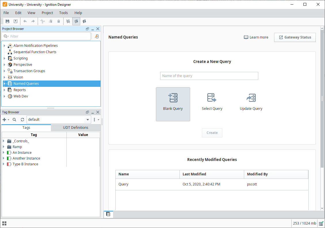
These new tabs follow Vision's footsteps by showing recently modified resources and providing quick links to documentation. In addition, you can easily create a new blank resource, or use one of the many new “quick configurations” that create an instance of the resource with some configuration changes already made.
Quick Start Configuration
While we love adding features that extend Ignition’s capabilities, we’re always looking for ways to help new users get up to speed. We found that a large portion of our user base (new and existing) do well in scenarios where they’re given examples to observe and explore. Items on the Ignition Exchange and the demo project provide plenty of content for users, but require new users to be aware of those resources, which they may or may not be at the point of installation.
Thus we created the Quick Start, where newly installed Gateways will ask the user if they want to opt into some demonstration configurations, such as a sample project and various simulations. If you opt in, then you’ll get all of the above, plus some video walk-throughs that get you into the Designer quickly.
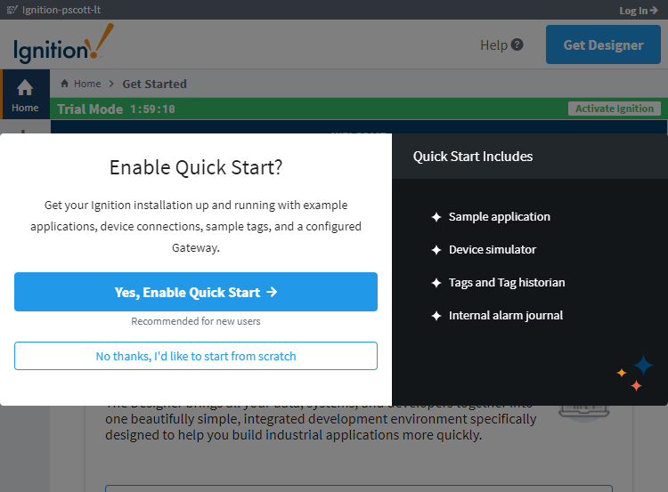
Furthermore, opting into this configuration will also provide some steps that lead users into the Designer, where the real building begins.
The best part is that they have a functional system right after installation, allowing them to get building right away without learning how to set up a simulator or database connection. The implication here is that you can quickly get a demo server up and running with very little effort. I am personally excited about this feature because I see it as a new opportunity to recreate Inductive University's library with the idea that this Quick Start has been applied first, making it even easier for anyone to follow along.
In Other News …
In addition to the features mentioned above (and those not mentioned out of the need for brevity), we do have some exciting announcements that don’t directly pertain to 8.1, which I’ll go over here.
Ignition on Docker Hub
As mentioned during ICC, we’re going to start maintaining official Ignition images on Docker Hub. If you like to stay on the bleeding edge, you can even pull nightly builds, allowing you to play with newly implemented features as we push them out.
I won’t go into the specifics of Docker and containerization, but hosting applications within lightweight virtual environments is a well-adopted practice by many IT groups nowadays. We endeavor to use modern technologies and approaches whenever possible, so providing official images seemed like a logical step for us. Besides, who can argue with on-demand Ignition installation, with no configuration and zero dependencies?
8.1 Certification and IU
Even before 8.1’s release, we’ve received quite a bit of interest in 8.1 certification. I figured I’d take a moment to address it here, although there will be some additional messaging sent out.
In short, if you’re already 8.0 certified, then you’ll be 8.1 certified automatically once the new certification level is available (shortly after this post goes up). There will not be any sort of upgrade test for you to take, nor will you have to complete the 8.1 Inductive University course.
If you have an 8.0 test in progress, you’ll be granted the 8.1 certification after you successfully complete the test. If you or a colleague of yours doesn’t have any prior certification with us, then the normal rules apply: Get the 8.1 credential on IU first, then you can request an 8.1 test.
Looking back at all of the features and changes that have been introduced between 8.0.0 and 8.1.0, there’s enough new features that we could have made an upgrade test like we normally do, but we really didn’t feel right about it this time around — given a little time and our documentation, we felt that any 8.0 certified user would be able to figure out any of the newly added features. Forcing every 8.0 certified user to retest for 8.1 just felt unnecessary.
That being said, once 8.2 rolls out the door we’ll likely go back to our normal routine of requiring a completed upgrade test to maintain certification.
Speaking of IU, you can find a small summary of new IU videos we added since 8.1.0 here.
Ready to Upgrade?
Grab an installer from our Downloads page and get started. If you’re looking to upgrade from Ignition 7 to Ignition 8, I’d highly recommend you look over our Upgrade Guide in the 8.1 User Manual, as it points out some things you may want to be aware of before you upgrade.
The Updates Keep Rolling In
To learn more about all of the other changes and updates in 8.1.0, check out the release notes or the aforementioned User Manual. As always, we encourage you to tell us what you think and what you’d like to see in upcoming releases. As the release train keeps on pace, stay on the lookout for 8.1.1 to arrive at a station near you soon.