The value of a hammer is judged by how well it drives a nail and the quality of a shovel is assessed by its utility in digging a hole efficiently. Likewise, the value of an HMI / SCADA project is derived from how well it can perform the task it was created to do.
The graphics of an HMI (human machine interface) project are important, not because they are aesthetically pleasing or visually interesting, but because they can make the project a more effective tool in the hands of its operator. Everything about an HMI project should be focused on one specific purpose: making it the best tool it can possibly be.
Design choices for your HMI project should always be dictated by one question: How can the HMI maximize the operator’s efficiency?
An optimized HMI can make an operator more efficient by conveying important information effectively. Always keep the end-users of your HMI project in mind. They will be the ones using the project regularly and if the HMI doesn’t work for them, it will be essentially worthless.
To help you design HMI screens that are optimized to improve performance, we have assembled several design tips. This tip sheet covers one of the most powerful design principles you can use to optimize your HMI projects – creating emphasis.
Why Emphasis is Important
No matter how automated a manufacturing process may be, there is still a need for an operator to monitor it, control it, and at times, intervene to resolve problems. A high-performance HMI can aid operators in quickly assessing what needs to be done. To do this, it’s important that an HMI be designed to show the operator what’s important by deliberately calling attention to it. The best way of doing this is a design principle called emphasis.
In the context of HMI examples, to use emphasis is to give an object, component, or data point special importance or significance. Your goal should be to draw the attention of the operator to the important information they need in order to do their job effectively. If an HMI project does this well, the result is more efficient operators who find and resolve problems quickly.
What to Emphasize
To effectively use emphasis, you must first determine what information is most crucial for the operator to see. To do this, evaluate the HMI screen and rank the information and functions according to how important each one is to the operator’s job. The higher the importance the more emphasis it should have to quickly catch the operator’s attention. Keep in mind that this hierarchy of importance can change from operator to operator and you may need to look at other HMI examples and get feedback from users in order to tailor each HMI screen to satisfy individual needs.
4 Ways to Create Emphasis
There are several ways to give one element emphasis over another, but the four simplest and most powerful techniques you can use are size, color, position, and isolation.
Creating Emphasis Through Size
Which square stands out?

This is easy to see because the larger square is clearly different from the others, so it draws our attention. This is because the human eye is incredibly attuned to finding patterns, and anything that breaks a pattern will immediately draw our attention. In this case all the squares are the same size, except one; therefore the large square has more emphasis than the others.
Applying this to an HMI project can be very straightforward; the larger the element on the screen, the more attention it will command. This only works if the size difference is relative to other elements on the screen. If all the elements on a screen are large none of them will have emphasis over the others.
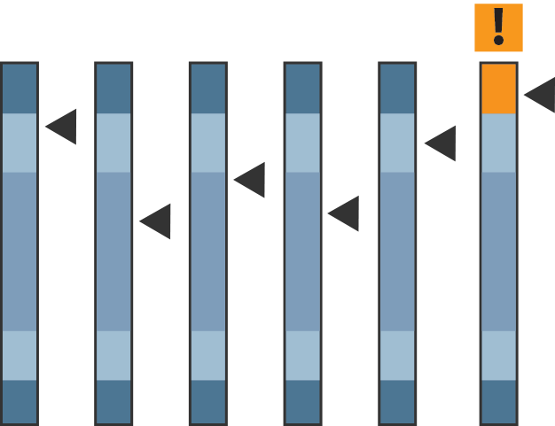
Creating Emphasis Through Color
Which square stands out?

The orange square stands out because it’s different than the others. Whenever a familiar pattern is broken, emphasis is created. The more a color contrasts with its surroundings the more emphasis it will have.
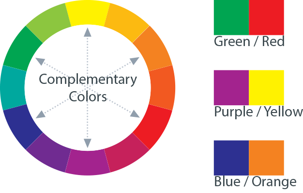
Complement Colors
Complementary colors are greatly different from one another because they are opposite from each other on the color wheel. Using complementary colors together can be a good way of creating emphasis.
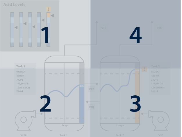
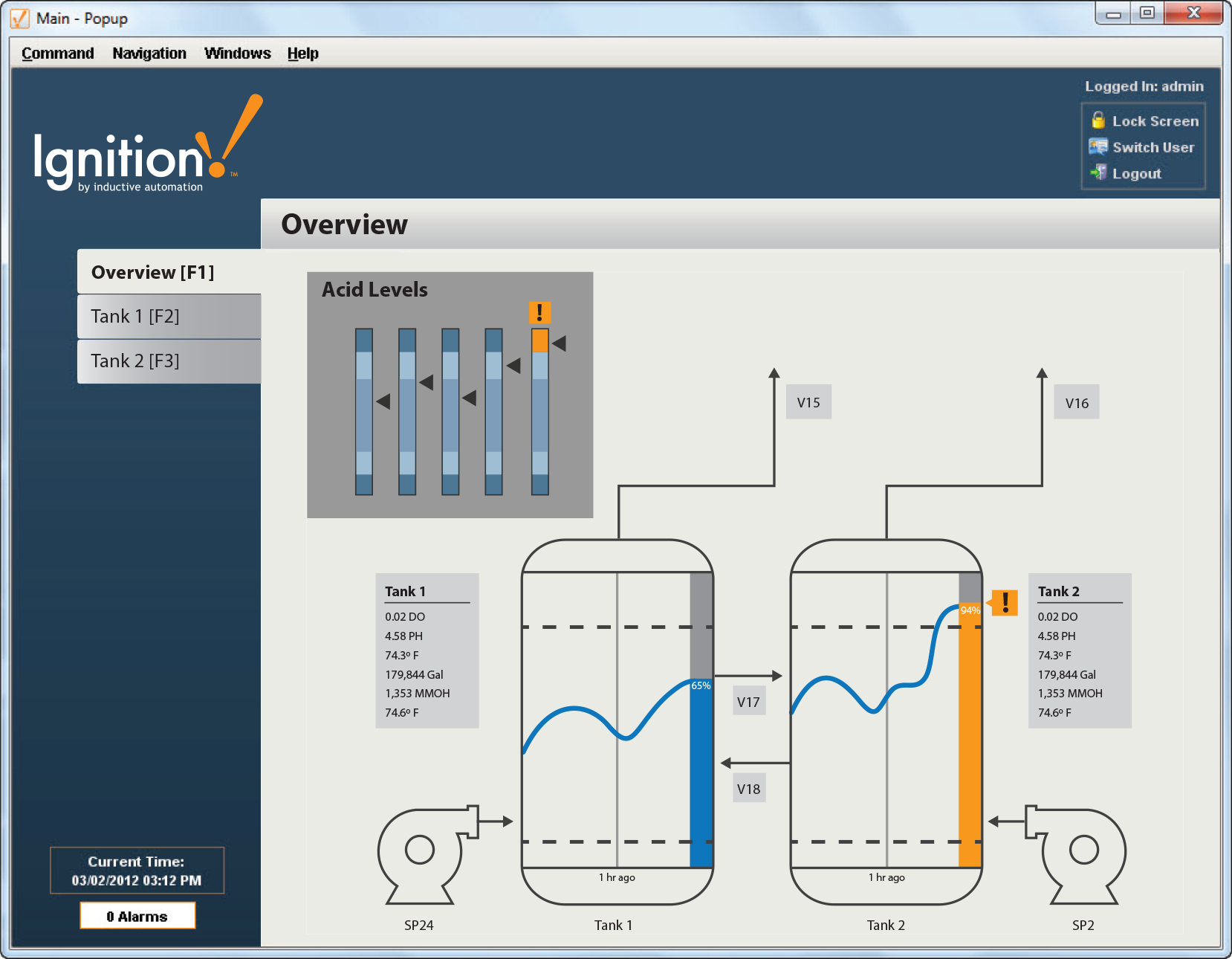
In an HMI project, color is especially useful in creating effective alerts. To draw an operator’s eyes quickly, use a color that will easily stand out. To do this, the color needs to be unique on the screen, so if your HMI screen is predominantly blue, don’t make your alert blue, make it orange. The general rule for the color of HMI screens is to keep them neutral (not too light or dark) and monotone (one color). Gray is a good choice because it will easily allow colors to pop out and draws the operator’s attention to maximize emphasis.
Color in Action
Color can be powerfully used to draw attention to important information, like alarms.
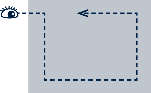
Creating Emphasis Through Position
Which square stands out?

The average viewer tends to say the square on the top left. This is because in western culture we typically read from top to bottom and left to right, and as a result our eyes are trained to move across a page in a certain way. You can take advantage of this by placing elements you want to emphasize in places that our eyes expect to see them. Objects of high importance should reside in the top left of a page, just like the title of this tip sheet does so you can quickly see what it is about.
This principle can be effectively used in HMI screens as well. To do this you can break the screen into four quadrants. The top left is the most highly traveled by the viewer’s eye, so it is prime real estate; whatever you put there will get noticed. The bottom right is less traveled, information placed there will still be seen but will have less importance.
Creating Emphasis Through Isolation
Which square stands out?

The single square separated from the group of squares stands out because it is isolated from the others. Isolation is created when an object has empty space around it; this creates emphasis which can easily draw a viewer’s eye. The more empty space around an object, the more emphasis the object will have. If you take a blank piece of paper and put a single dot on it, no matter what you do your eye will immediately be drawn to the dot on the otherwise blank page. Regardless of how small the dot is, the dot’s isolation gives it huge emphasis.
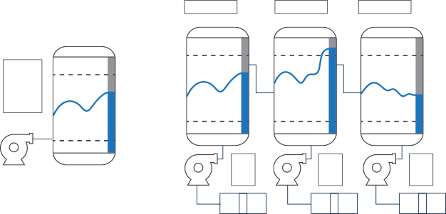
To effectively use isolation in an HMI project you need to make sure your HMI screen is not cluttered. The more information that is displayed on an HMI screen, the more difficult it is to draw an operator’s attention to one specific part of it. Keep your screens simple and it will be easier for operators to focus on what is important. The simpler the screen the more emphasis each element of the screen will have.
Combining Techniques to Create Emphasis
Each of these techniques can be used on their own, or they can be combined to create emphasis with even greater effect. Use multiple emphasis techniques to create a hierarchy of importance for each element on the screen. Experiment with different combinations and check out other HMI examples to find and create the desired effect. Remember that the goal of using emphasis in your HMI project is to make it a more effective tool in the hands of its operator.
Amplify Emphasis
Try combining emphasis principles to create compelling HMI screens that optimize operator efficiency.
Last Updated on: November 4, 2024

About The Company
Inductive Automation
Inductive Automation is a leader in industrial automation
software that empowers its customers to “Dream It, Do It.”
It was founded in 2003 by Steve Hechtman, a prominent system
integrator with a quarter-century of experience, who was
determined to solve SCADA pain points. As a result, the
company created its flagship product Ignition, the #1
platform for SCADA, HMI, IIoT, MES, and more.
In business and privately owned for over 20 years,
Inductive Automation’s global presence is flourishing:
140+ countries have Ignition installations, there are
4,000+ integrators in its integrator program, and 65% of
the Fortune 100 use Ignition. The company has earned
numerous industry accolades, and was recently recognized
in Automation World’s 2025 Leaders in Automation program
in five categories.
Want to stay up-to-date with us?
Sign up for our weekly News Feed.
By clicking "Sign me up," you agree to Inductive Automation's Terms of Use and acknowledge that you have read Inductive Automation's Privacy Policy.