HMI Redesign: Give Your Screens A Performance & User-Experience Makeover

It’s no secret that people love a makeover story, especially one involving a dramatic “before and after.” At last year’s ICC, Inductive Automation’s Marketing Co-Director Steven Fong, UX Designer Ray Sensenbach, and Design Services Manager Stevenson Yuan presented a talk titled “,” essentially a makeover presentation for industrial interfaces. Our design gurus took real Ignition projects submitted by the Ignition community members and gave them a complete overhaul to improve their design layout, user experience (UX), and overall performance.

For many engineers, designing an interface might seem like a second- or third-tier priority when creating their industrial system, since it appears to be a purely cosmetic detail. In actuality, good interface design can increase operator productivity, decrease human error, and even make operators feel more at ease while on the job. That’s the power of user interface (UI) design.
There are many strategies project creators can leverage to improve the efficiency of their HMI screens, in a few simple and easy steps. Read on to see how IA’s design team used these methods to makeover each project, and how you can use them in your own projects.
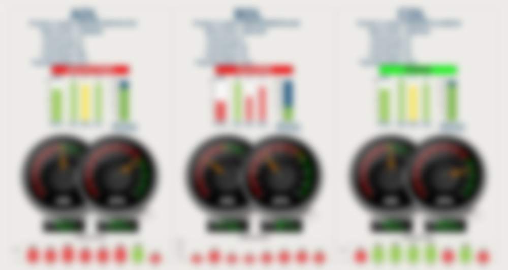
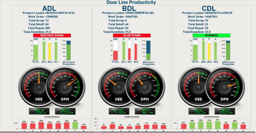
One of the most dramatic overhauls that the design gurus took on was submitted by an anonymous client in the manufacturing industry. Here’s the HMI example they were using:

At first glance, this screen’s 3D rendering and bright colors might look sophisticated, but these flashy design elements can actually make the operator’s job harder. Bright colors grab unnecessary attention, while overly complex graphics distract users from gleaning the necessary information from the image.
Our design gurus utilized six main rules of graphic design to take this project from cluttered to clean and efficient. Read on to learn how to apply these techniques, and see them in action on this project.
1. Perform the Squint Test
The Squint Test is a great first step to refining your graphic interface, and it’s as easy as it sounds: all you have to do is squint. As you look at the blurred HMI examples, see what stands out. These areas of focus are what stand out to your user the most, too. Are these highlighted areas the most important indicators on the screen? If not, the rules below will teach you how to better emphasize areas of importance, and de-escalate elements that are less crucial to the system.
2. Limit Color
Color is one of the most important aspects of visual design, and one of the easiest tools you can use to draw attention to important occurrences on the screen. However, just as color can draw attention to important information, it can also distract if it is used too liberally, as we saw in the squint test. In the above HMI examples, there are over 10 colors at play on the screen. This keeps the focus away from the most important information: the OEE of each door line.
By eliminating unnecessary colors, operators are able to efficiently focus on what is important. For these HMI examples, pulling the color out of all but the most urgent areas will help the operator easily interact with crucial elements, like a mechanical shutdown, without the distraction of less important indicators. Our makeover gurus used bright red to indicate a mechanical shutdown, and green to show that devices are running. All other elements were toned down to blues or grays.
3. Leverage Visual Hierarchy
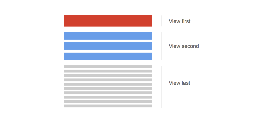
Visual hierarchy is an intuitive tool you can use to guide your end user through your project. A newspaper’s use of text is a great example of a visual hierarchy: the most important news is the headline, made of large bold text, then subheadlines with less important news are still bold, but much smaller than the main story. Finally, the details are in small print. On an industrial interface, make the most important factors the largest and easiest to spot, while less relevant information can be visually de-escalated with smaller fonts or lighter colors. Be sure to keep your text within the same theme or font when using visual hierarchy to limit distractions, and again, only use color when it’s a crucial element.
4. Decrease Visual Noise
Visual noise consists of all of the extraneous visual details that distract from the main focus of your interface. This includes borders, shading, scroll tabs, and unnecessary buttons, which overwhelm the eye as it moves around the page. Visual decluttering leaves room for more open whitespace, which allows the eye to rest and focus on the most significant areas of the screen. Look around your interfaces for unnecessary details that do not support the main goal of the screen, and simplify the graphics to keep them clean for your end user. This way, all of their energy can be directed to monitoring important information, rather than getting lost in design details.
5. Avoid Redundant Indicators
An easy way to decrease visual noise and distraction is to eliminate redundant elements, like graphic charts or images that repeat in other areas of your HMI. These take up space and distract from the main goals of the interface. Eliminate information that is already available elsewhere on the platform; not only will it increase the screen’s efficiency, it will also improve the navigational experience for operators and end users.
6. Simplify Images and Charts
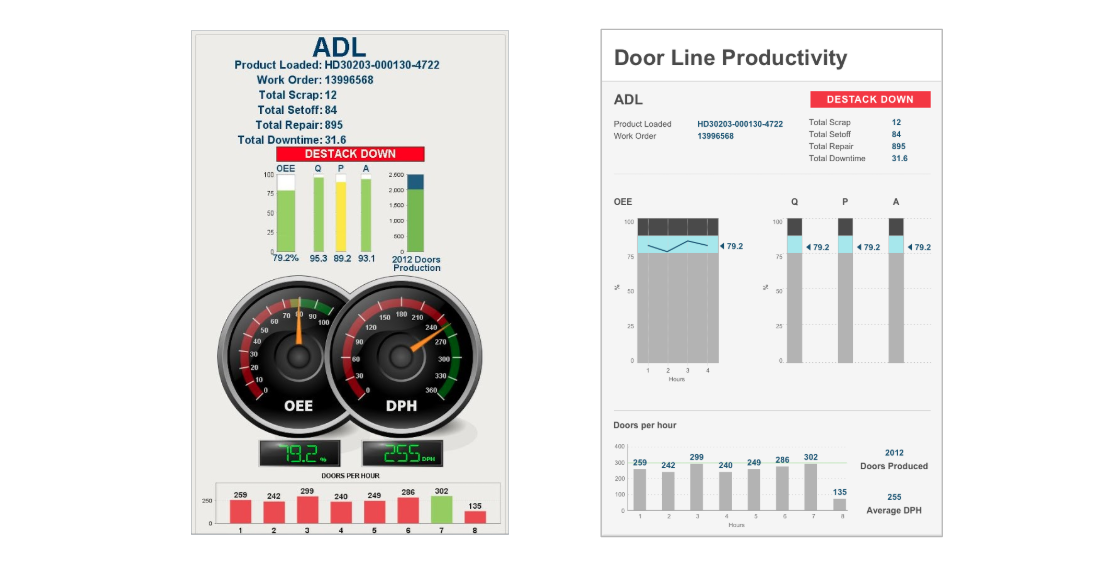
Graphics, especially 3D rendered ones, can look cool — however, that’s all they accomplish in many cases. In fact, the image can veer focus away from content that is actually being displayed by the graphic. High-performance charts like sparkline charts enable users to quickly ascertain information without having to interpret a dial or look at multiple graphs, plus they take up less space. IA’s design gurus eliminated the complex gauges on the original HMI example screens in favor of a sparkline chart; this shifts the focus from the graphic image to the actual information being relayed: OEE rates.
Here is the final product Steven, Ray, and Stevenson created:
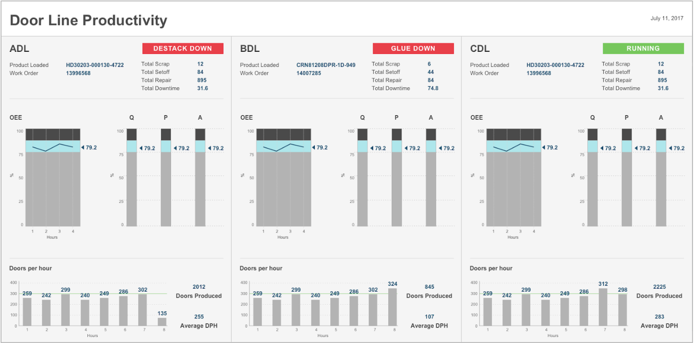
The result is dramatic: after analyzing the table and determining its purpose (perhaps with a squint test), the IA gurus started their overhaul by toning down the color of the less important elements, changing bright reds and greens to blues and grays, highlighting the most important information, OEE, in blue. The most crucial information, whether the line is running or down, remains in bright red and green, since it is the most important thing for the operator to monitor.
Next, the team eliminated the gauge graphics, which didn’t provide helpful information and also had some redundancies on Doors Per Hour. They replaced the graphic gauges with a sparkline chart, which decreased visual noise for better user experience, and made the information easier to read.
The team then determined locations of the elements by using visual hierarchy, based on the needs of the organization. Now, the screen illustrates all the key components without effort for the operators, it’s easier to read, and increases operator efficiency. Overall, the IA design team’s efforts resulted in a makeover story worth the buzz.
Looking for more resources on HMI design? We’ve got you covered:


Up next in our design series, we will be covering HMI navigation — read HMI Extreme Makeover Part 2. In the meantime, tell us about your best practices for designing HMI screens. We’d love to hear in the comments below!